The Symmetry of My Life | An Autobiographical Visualization

Personal data is increasingly seen as a political and economic weapon, used by evil industries against the will of individuals. But personal data is also a resource of great value as it provides a medium to reminisce, to reflect and to share personal stories that shape our identities. I explore with this visualization design the peculiarities of visualizing personal data for the purpose of private reminiscing and public sharing.
Concept
In this project, I explore the process of designing a relatable, aesthetically pleasing, intriguing visualization; a visualization that is as personal as the data it represents; and a visualization whose purpose is to support the telling of personal stories; from telling stories to a semi-private audience like colleagues at a conference to telling more intimate stories to close relatives who might have shared some moments of my life.
The data I collected for this project consists of work-related data and personal data. The backbone of this visualization is the manual activities I logged for the past two years and a half. To log my activities, I used the Toggl application. The application consists of a simple timer that makes it possible to record activities in real time activities and to associate to each activity a description and a category.
#1 | INSIDE-OUT LAYOUT
#2 | OUTSIDE-IN LAYOUT
#3 | GRID
Iterations
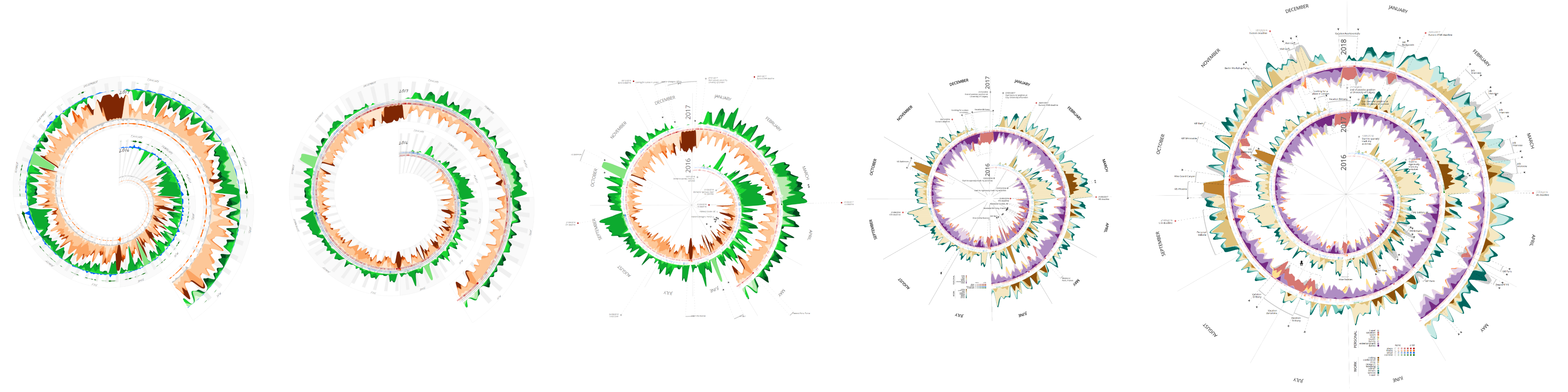
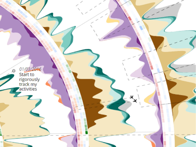
I started with design #1, in which the streams in green represent work-related activities. The streams in orange represent personal activities. This layout emphasizes the complementarity of work and life activities, and large amounts of white space between the two streams indicate irregularities. For example, in the close-up view above the IEEE VIS conference at the end of October notably contains very few white space – sign of little non-logged activity (such as sleep). In this design, the small filled harts in orange, grey, blue and green represent the daily numbers of steps, floors, emails and SVN commits.
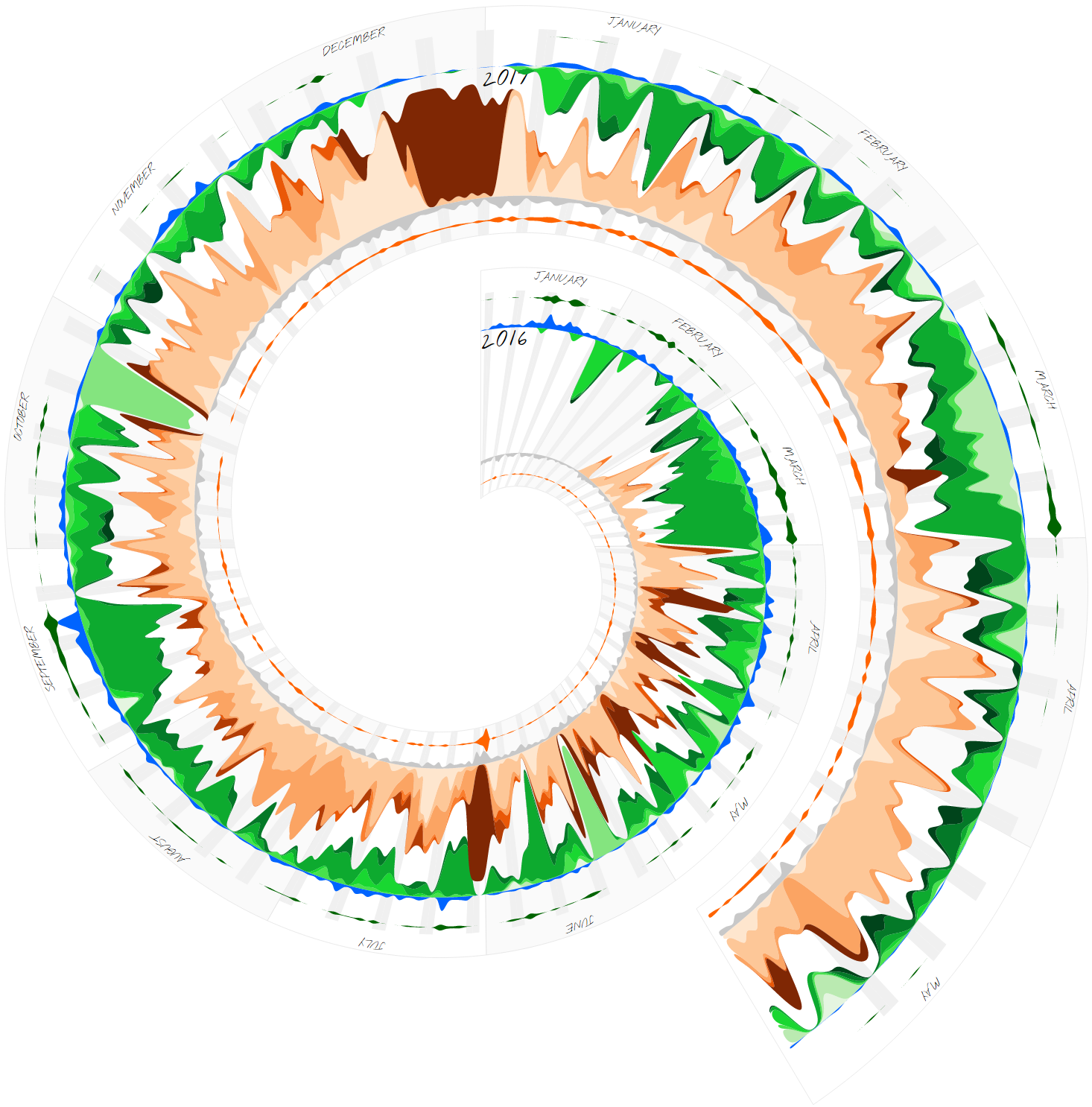
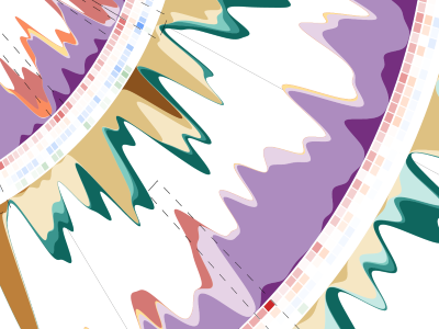
Design #2 emphasizes the cyclic patterns across years rather than the complementary at each point in time. Indeed, larger amounts of white space between two consecutive turns of the spiral indicate that the patterns of activities are different from one year to the other. In this design, the daily numbers of steps, floors, emails and SVN commits are shown inside the mirrored streams, using colored squares of varying opacity to convey their magnitude.
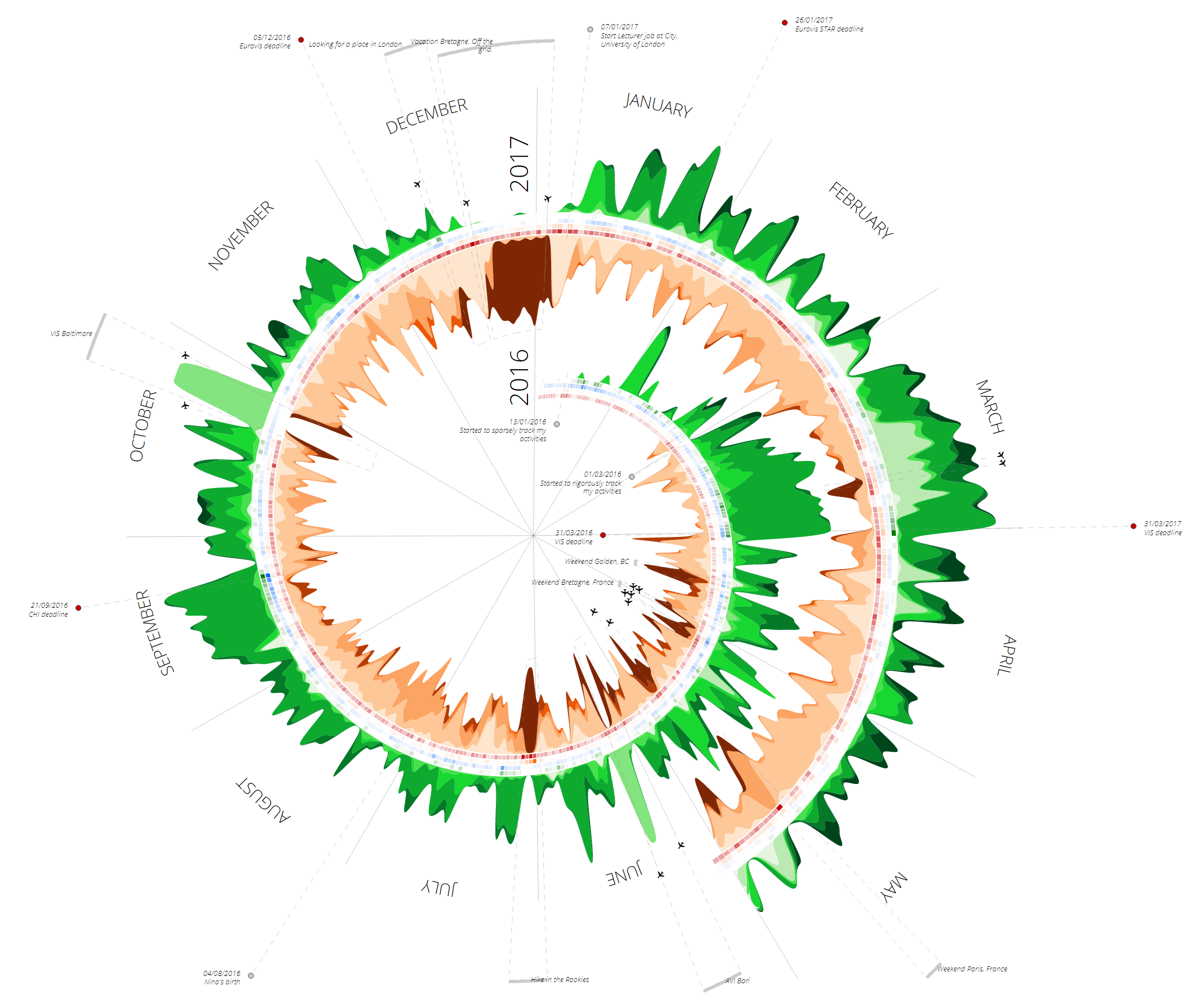
In designs #1 and #2, months are repeated each year (i.e. for each turn of the spiral). Displaying the months like the hours in design #3 on a clock makes it possible to draw consecutive turns closer to each other. They now appear to fit into each other when cyclical patterns exist, typically in March of each year. To refine this design, the alternating white and grey zebras that communicate weekdays and weekends in the previous designs are removed; a radial grid is added in the background; and a simpler font is used. Some annotations are added.
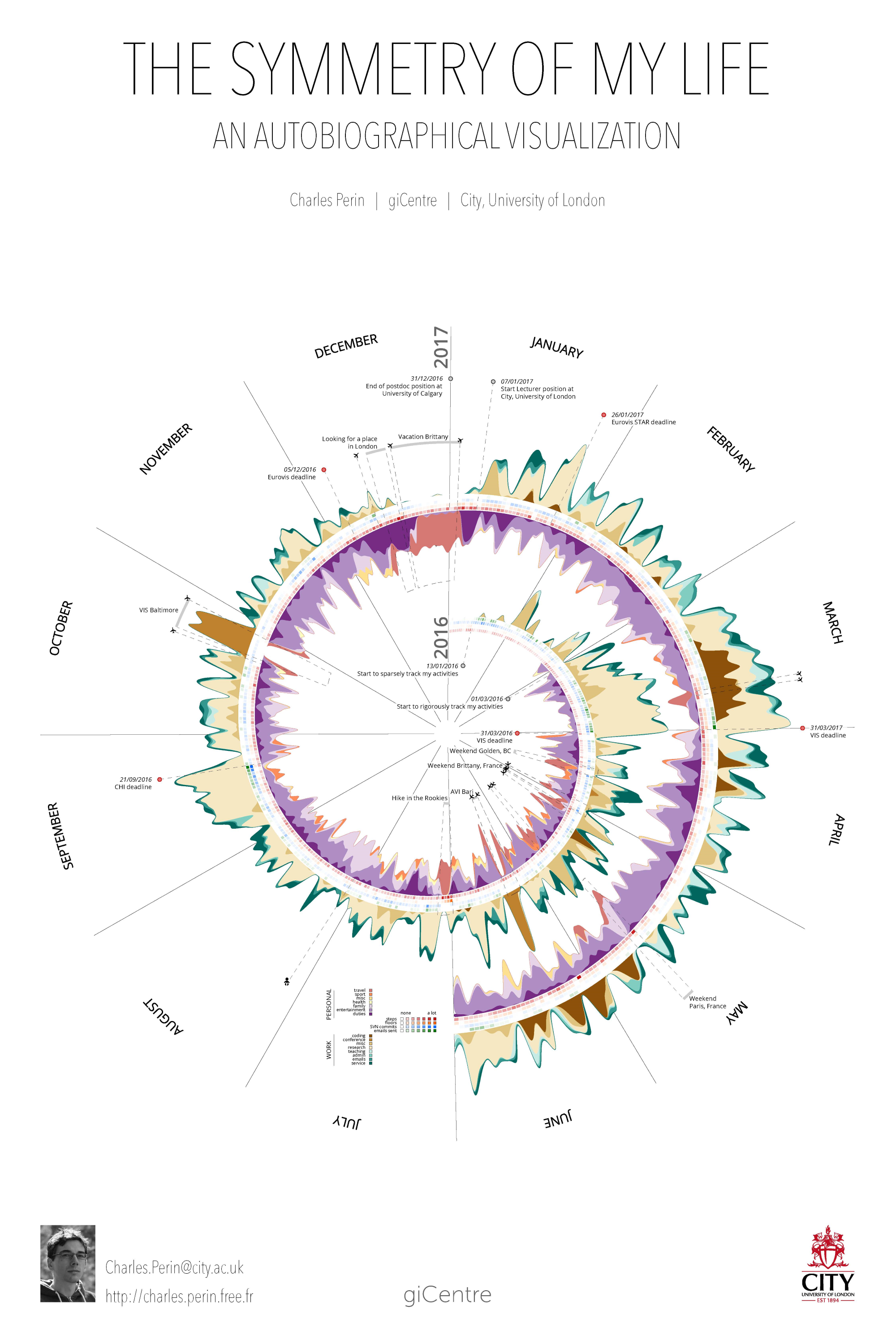
IEEE InfoVis 2017 poster
A key element of this visualization is that I made several choices that go against guidelines for good visualization design. For example, the radial layout is known to distort the data and is more difficult to read than a linear layout. The stacked area charts on each side of the spiral also have the reputation of being difficult to read as they distort the data and make it difficult to compare streams. Further, the activity categories are vague enough to not detail too personal aspects of my life; the scale for quantitative data does not provide any value, ranging from “none” to “a lot”; and there is no scale at all for the stacked area charts. One cannot tell how many hours I work per day, per week, per month, or how many emails a day I send, or how much time I spend teaching. I made all these design choices so that one can get the gist of the story, but cannot retrieve any precise value. In the specific context of this work, knowing absolute value is not the point. What I wanted to convey is a relative comparison of work and life activities, and to emphasize recurrent patterns that might emerge.
More than following the golden rules of visualization design (efficiency, accuracy, truthfulness, clarity) many people want to craft visualizations that are as personal as the stories behind the data and that serve a specific purpose, such as triggering empathy and making people laugh or cry. Personal visualizations can become part of the spaces we live in, make people emotionally connect to, and increase their awareness of, their data. But crafting autobiographical visualizations is a tedious task without the right tools. The space of authoring tools for personal visualization is ripe for research exploration.
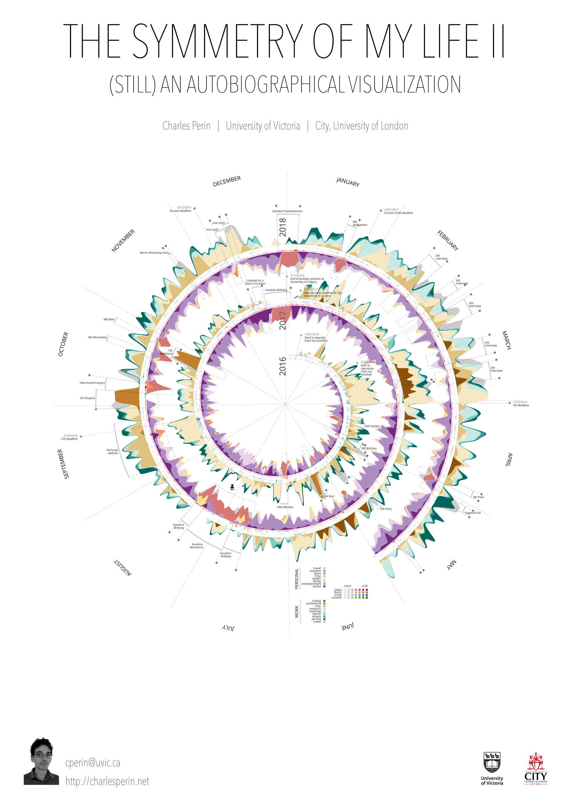
IEEE InfoVis 2018 poster
In 2018 I updated the poster for the following reasons:
1. The poster triggered a lot of interest and discussions from the VIS attendees in 2017. I expected this second version to generate the same interest. Not that my life is particularly fascinating, but students and academics can easily reflect on these events and work-life patterns.
2. This poster aligns well with the Vis Arts Program theme of that year on data and identities, where I also presented an annotated portfolio on the project.
3. It’s a nice poster to hang on a wall.
4. Last but not least, I spent a lot of time and energy collecting my data for 12 more months, and I am not sure I can keep doing that for long without endangering my mental health.
A few minor things changed compared to last year’s design. For example, I added 'travel' as a new category that exists for both personal and work-related activities. In the previous version 'travel' was associated to 'vacation', which is definitely less accurate. Perhaps the most interesting fact in this version is how little I have had a personal life since the beginning of September 2017. Except the period around Christmas during which I went on vacation, my life has been largely dominated by my work. The reason is quite simple: in September I started to work on my job applications, designing and building my personal website, before working on my application package then my job talk, until the interviews took place in February and March. An that was on top of my regular job, with a lot of teaching happening during the winter and the inevitable March 31st deadline. It shows quite well that finding a job in academia is, although a unique and enjoyable opportunity, also a long and demanding process.
Video
Project Publications
-
 The Symmetry of My Life II IEEE VIS 2018 Electronic Conference Proceedings, Berlin, Germany. IEEE. 2018.

-
 Cycles and (A)Symmetry | Exploring the Design of Shareable Personal Visualizations IEEE VIS 2018 Arts Program Annotated Portfolios, Berlin, Germany. IEEE. 2018.
-
 The Symmetry of My Life: An Autobiographical Visualization IEEE VIS 2017 Electronic Conference Proceedings, Phoenix, AZ, USA. IEEE. 2017.