An Illustrative Data Graphic in an 18th–19th Century Style
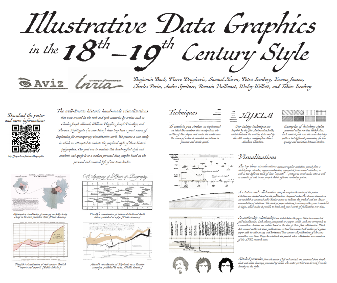
The well-known historic hand-made visualizations that were created in the 18th and 19th centuries by artists such as Charles Joseph Minard, William Playfair, Joseph Priestley, and Florence Nightingale have long been a great source of inspiration for contemporary visualization work. Tufte, in particular, praises much of this early work—such as Napoleon's march—for its graphical excellency but also its aesthetic, elegance, and technique. The specific style of the early graphics arose from a combination of hand-crafted appearance, clear and clean graphic design, precise data depiction, coupled with a storytelling layout.
Click on the image to download the high-resolution poster in pdf format.
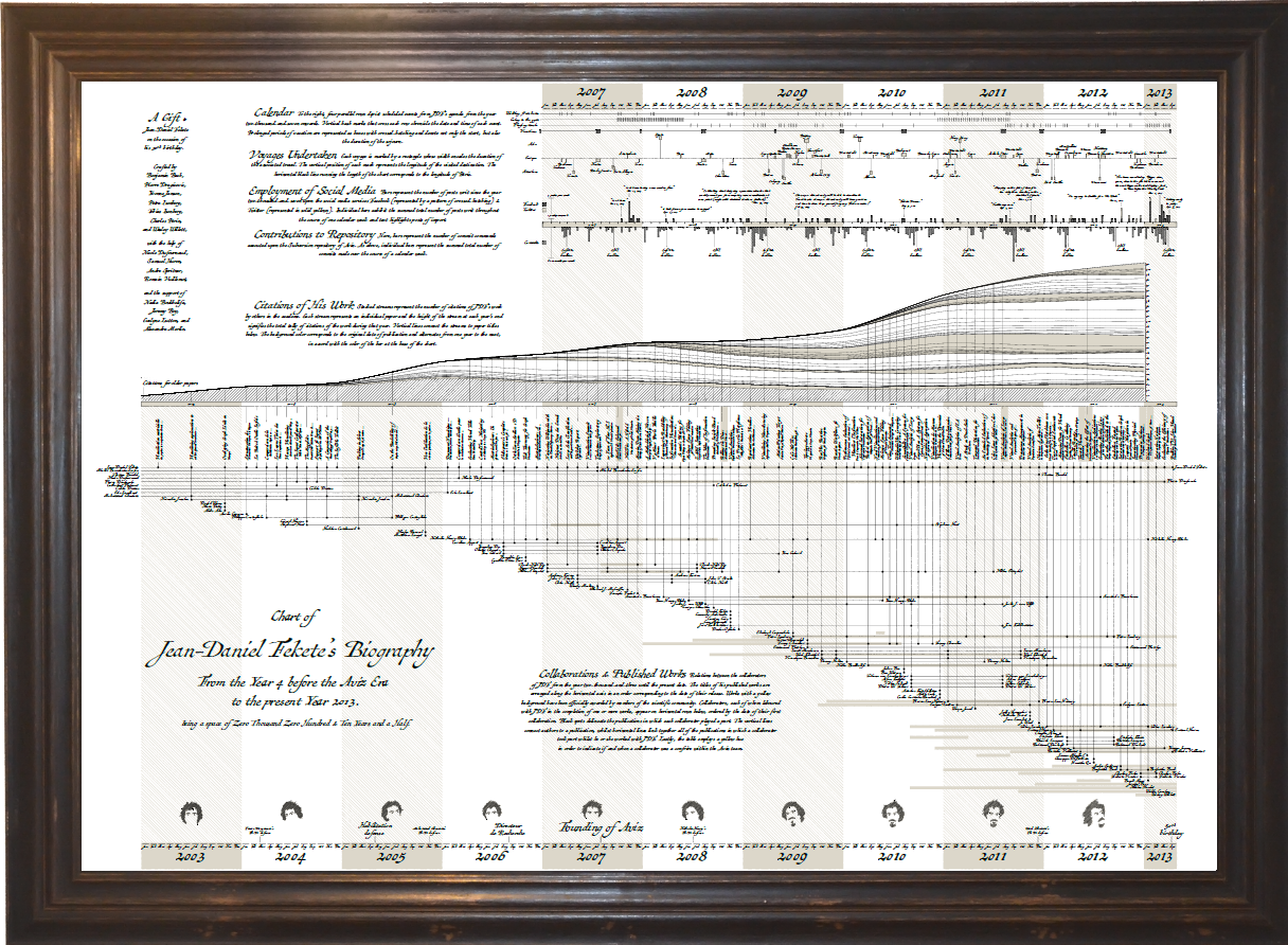
We present a case study in which we attempted to imitate the graphical appeal of historic infographics. Our goal was to emulate, in particular, the hand-crafted style and aesthetic for a modern personal data graphic that shows the historic evolution of research activities from the perspective of our team leader. We provide details on the type of data we chose to tell his story and how we emulated the style of historic data engravings to create a unique present on the occasion of his 50th birthday. The graphic was well received and is now permanently being exhibited.
Click on the image to download the high-resolution poster in pdf format.


