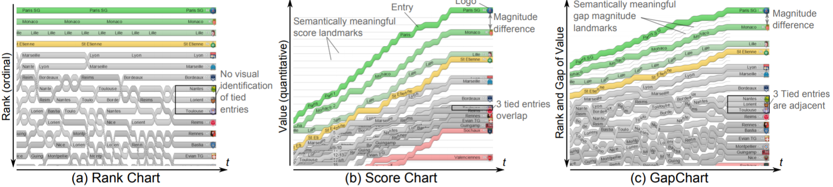
Gap Chart


Gap Charts are a novel class of line charts designed for visualizing the evolution of rankings over time, with a particular focus on sports data. Gap Charts show entries, e. g., teams participating in a competition, that are ranked over time according to a performance metric like a growing number of points or a score. The main advantages of Gap Charts are that 1) tied entries never overlap—only changes in rank generate limited overlap between time-steps; and 2) gaps between entries show the magnitude of their score difference. We evaluate the effectiveness of Gap Charts for performing different types of tasks, and find that they outperform standard time-dependent ranking visualizations for tasks that involve identifying and understanding evolutions in both ranks and scores. Finally, we show that Gap Charts are a generic and scalable class of line charts by applying them to a variety of different datasets.
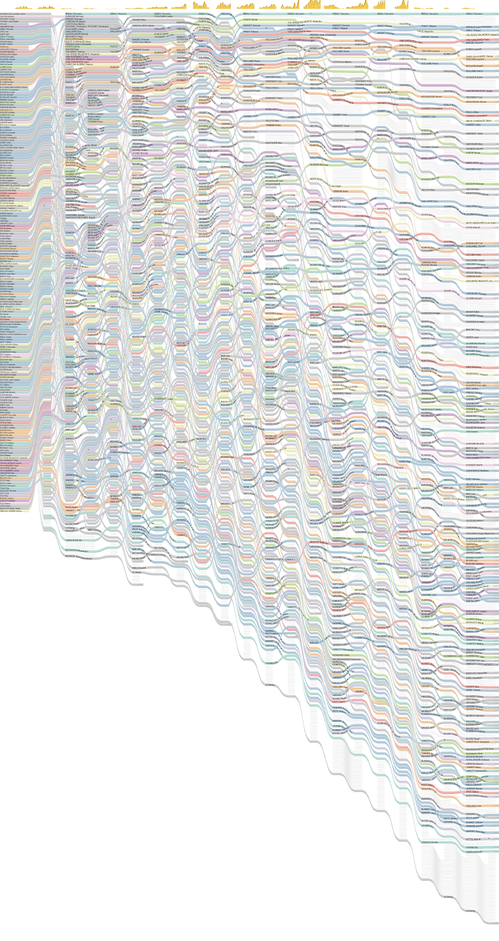
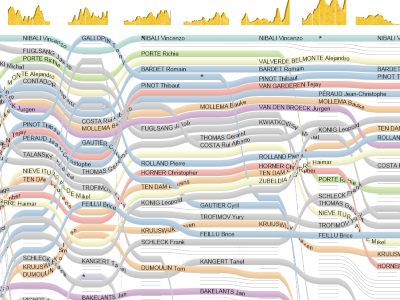
Le Tour de France at a Glance
Temporal evolution of "Le Tour de France 2014" cyclists ranking after each stage. In contrast to standard snapshot ranking tables used to represent this ranking, our visualization clearly shows the temporal evolution of each cyclist’s ranking and global trends for each stage.
The image shows the evolution of 198 cyclists' rankings after each of the 21 stages of the Tour de France. The magnitude landmarks (thin gray lines) represent 1 minute gaps between cyclists. Colors encode cyclists’ nationality, and stage miniatures provide context at the top. The chart clearly shows that many changes occurred in the rankings during the second stage of the race, which means this stage was key. After that, rankings remained stable for three stages, before changing dramatically once again. Tour de France enthusiasts will also see that 'flat terrain stages' generally do not impact rankings or gap magnitudes, whereas 'mountain stages' strongly impact both.
The expert eye will see that Valverde lost his second position three stages before the end of the race, and that Porte constantly decreased in ranking during high mountain stages, while he was ranked second.
< Click on the image to download the high-resolution pdf.
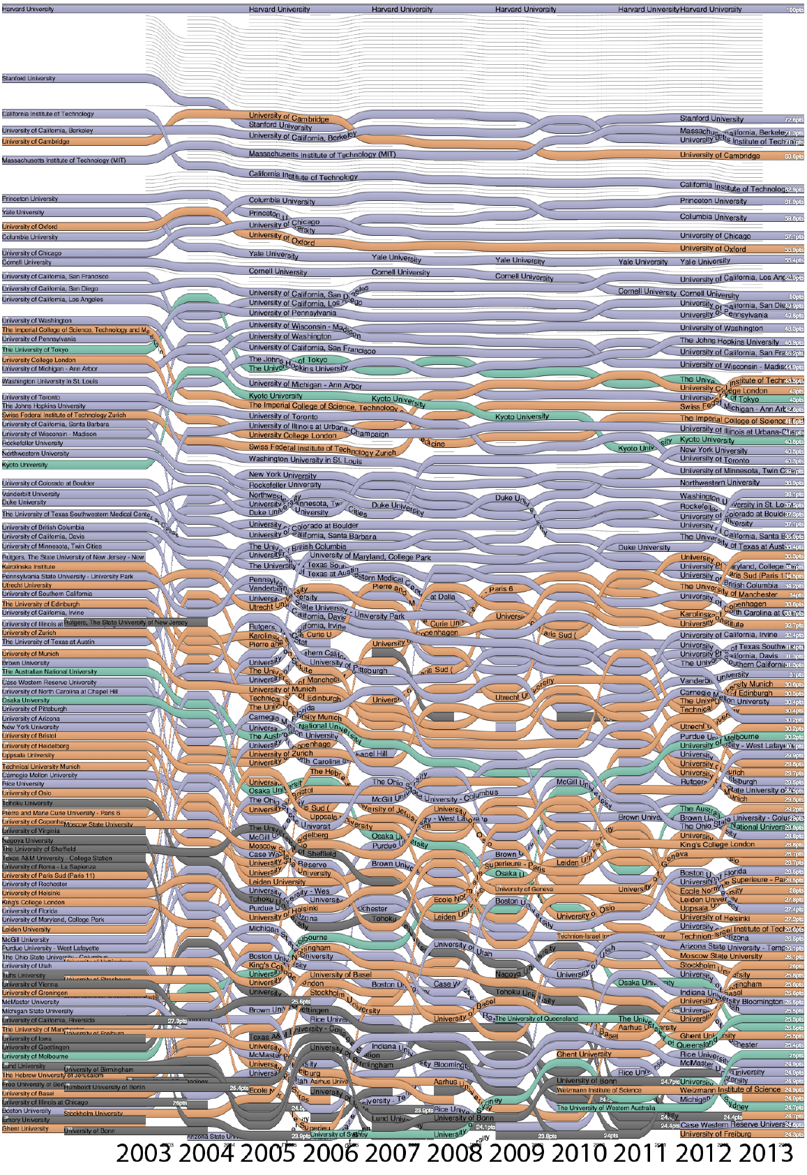
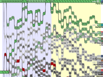
ARWU top 100 University Rankings between 2003 and 2013
Evolution of the top 100 universities' rankings over 10 years, according to the ARWU Shanghai University Ranking, using a Gap Chart. Colors encode world regions (North America in purple, Europe in orange, Asia in green, and unclassified in dark gray). The most immediate observation is that the entry ranked first (Harvard University) is far above all others. Below that, several universities struggle for the top-5 ranks, while competition is fierce at the bottom of the ranking. Nearly half the top-100 universities are North American; only five European and two Asian universities are among the first third. It is also interesting to point out that rankings varied a lot between 2003 and 2005. This was simply due to modifications of the ranking formula.
Video
Project Publications
-
 Using Gap Charts to Visualize the Temporal Evolution of Ranks and Scores IEEE Computer Graphics and Applications, Special issue on Sports Visualization. IEEE. 2016.


-
 Le Tour de France 2014 at a Glance IEEE VGTC International Data-Visualization Contest, VIS 2014, Paris, France. 2014.

-
 R2S2: A Hybrid Technique to Visualize Sport Ranking Evolution Proceedings of the IEEE VIS 2013 workshop: What's the score? The 1st Workshop on Sports Data Visualization, Atlanta, GA, USA. 2013.